Select date

GBM Brain Tumor Cancer Rising. Impacts of RF Radiation from Wireless Devices?


New government data, released in May by a member of the Danish Parliament, show a near doubling of this fatal brain tumor, glioblastoma multiforme, since the year 2000. You can see the trend by following the orange line in the histogram below.
.
.
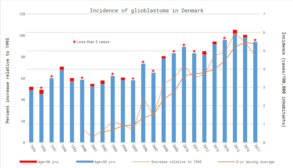
Incidence of GBM in Denmark, 1995-2017 (blue bars); % increase relative to 1995 (orange line).
Prepared by a Danish epidemiologist for Microwave News.
For the story —and some caveats— behind these numbers, please see companion article: “Danish Spike in GBM Is Back.”
After I received the Danish graph, I asked Alasdair Philips to make a similar one for English GBM which he has previously shown follows a similar trend. His data set doesn’t include the most recent couple of years; still, you can see the same approximate doubling. (For details, see our report on Philips’s study, and follow-up.)
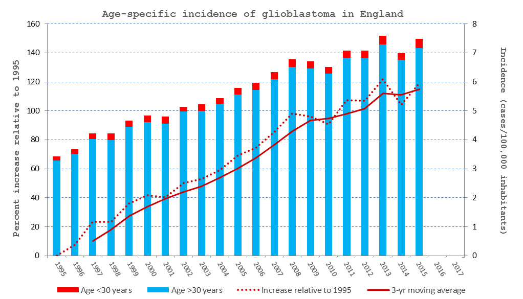
Incidence of GBM in England, 1995-2015 (blue bars); % increase relative to 1995 (orange line).
Prepared by Alasdair Philips for Microwave News.
In past articles, I have reported similar trends for GBM in Sweden and in The Netherlands.
Some Questions
- Are these trends real?
- Is the incidence of aggressive tumors truly going up in England, Denmark, Sweden and other countries?
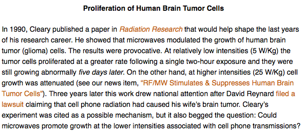
- Can RF radiation from wireless devices promote less aggressive tumors into GBM? (Steve Cleary showed this was possible 30 years ago.)
- Or, is all this just an artifact due to changing definitions of how brain tumors are graded and classified? Would some of today’s GBMs have been typed differently in years past?
- The artifact explanation is favored by the RF establishment. IARC’s Joachim Schüz and ICNIRP’s Martin Röösli argued this when I asked them about the Swedish tumor uptick a few months ago. Do the Danish data now give them pause?
- Why do so few people want to talk about these apparent increases in GBM? When asked, the Danish Cancer Society refused to comment, all the while advancing industry propaganda on Danish radio.
Let’s get some answers.
*
Note to readers: please click the share buttons above or below. Forward this article to your email lists. Crosspost on your blog site, internet forums. etc.

