Select date

Sizing up the 2017-2020 Housing Cliff Hanger


by David Haggith, The Great Recession Blog:

The best time to size up the collapse in housing that I called almost two years ago will be when it is over — so we can visualize its full extent. Since it is now over by some measures, though not by others, this might be as good as we get for awhile as a moment when we can pause to take a broad scan of the full extent of our damages to date. However, as you’ll see below, we’re still clinging to the side of a cliff. We’re not back up on top.
The purpose of this article is to give a little more perspective to my last article on the housing collapse with some updated information and graphs. Alhambra Partners has created some graphs that give a clear picture of our slide to date. As I said back in 2018, I did not think this collapse would be nearly as great as the housing crisis that caused the Great Recession, nor did I think it would be the cause of the next recession, but would just be a part of it.
A canyon formed in housing sales
First, let’s look, as a reminder, at sales (number of units sold), which I covered somewhat in my last article on housing:
The steep-sided canyon is evident, and you can see that sales, according to the National Association of Realtors, are still well below the summit they attained before I called the housing decline in the summer of 2018. In fact, the sales rate (red bars) even appears to be slacking off a little again.
The full depth of the drop in sales is greater than the decline that came in 2014 as a second dip on the tail of the Great Recession. The decline is also longer in duration, and it is still continuing, since sales have nowhere nearly recovered to their previous peak.
The drop in new-home sales started sooner than existing-home sales, and perhaps that is why new-home sales have now fully recovered:
A ravine formed in housing prices
Second, let’s see what effect the collapse in sales had on housing prices, which were not covered in my last article. The effect is most evident in new-home prices. The following chart shows the growth (or decline) rate year-on-year in new-home prices, which are still declining (i.e., below the 0% growth line), albeit barely:
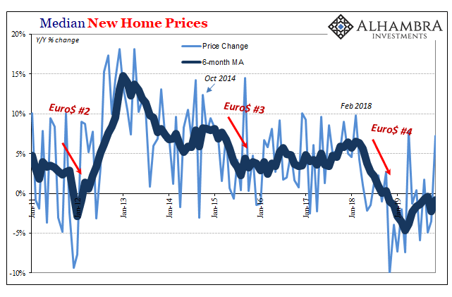
While sales (number of houses sold) have recovered, prices on the six-month moving average are still slightly falling, and they will have to get back to rising and then rise for quite awhile before prices recover to the point from which they fell. (Bear in mind, the graph shows the rate at which prices are rising or falling, not the price level.) So, actual prices haven’t started recovering at all yet. That means, even if sales hold as they are, prices are still months away from getting back to their peak level, as they are still slowly descending.
Here’s another graph that shows both the median house price (top graph) and the amount by which prices rose or fell each month (year on year):
You can see in the bottom part of the graph that the decline rate got to about a third the rate we saw in the great housing bust and has, so far, only gone on for about half as long. Price change is now just about back to neutral but not rising. The decline in overall prices (top part of the graph) is more significant than anything seen since the Great Recession, and is greater than any other time going back to 1963, but it is only about a third of what we saw during the housing collapse of the Great Recession.
So, it has turned out as I anticipated (though it is not completely over in all respects) in that it is not as great as the Great Recession and did not, in and of itself, cause a recession; but it is greater than any decline going back, at least, as far as 1963. (If the graph were logarithmic, showing essentially the percentage by which median prices rose and fell, versus total dollar amounts — the decline in the early seventies would probably look somewhat deeper then the current housing decline. I could not find a current logarithmic graph of home prices.)
The charts above are the national median, and the collapse did not, of course, hit all parts of the country. So, people in many parts of the country will have felt nothing. Even the collapse of 2007-2010 took a lot longer to hit some parts of the country than others, and did not take those parts down in price nearly as far. This one isn’t quite over in that sales of new homes have recovered to their peak, but prices are not even starting back up. They are just falling slower now than a year ago.
Read More @ TheGreatRecession.info
Loading...


