Select date

Down-to-Earth View of the “Recovery” in Near-Real Time, Eight Months into the Pandemic


by Wolf Richter, Wolf Street:
 As seen by indicators that have sprung up as a result of the Pandemic.
The US economy has turned into the weirdest concoction ever. Some aspects are booming, such as anything related to online shopping and entertainment, while other aspects are in the worst depression ever, such as airlines and hotels. So now eight months into the Pandemic, here’s my monthly update on the recovery in cities, in terms of what people are doing and where they’re going, if anywhere, as seen by the near-real-time indicators that have sprung up as a result of the Pandemic.
These raw unadjusted indicators compare daily or weekly data this year to how it was just before the Pandemic, or how it was at the same time last year. Since the data is not adjusted, it stumbled over the shift in the calendar of Labor Day, which this year fell on September 7, while last year, it fell on September 2. Independence Day was similar. But that’s the beauty of raw data.
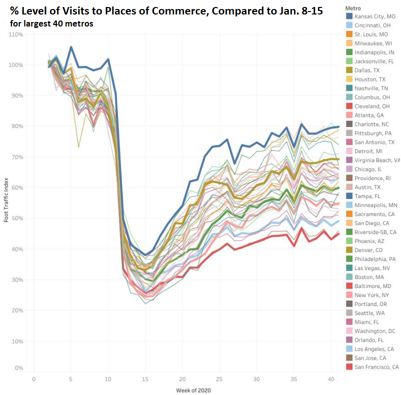
People going to “Places of Commerce.”
How many people are going to stores, malls, restaurants, hotels, movie theaters, airports, hospitals, offices, other places of commerce and other points of interest in the 40 largest metro areas in the US? The AEI’s weekly Index tracks this based on cellphone GPS data from Safegraph.com (everyone tracks cellphone GPS data, including Google for its traffic indications on its maps).
It doesn’t track how much money they spent, but how many people visited places of commerce, and it compares the number of visits on a weekly basis to the number of visits in the pre-Covid week ended January 15. A value of 100% would mean that visits are back to the January “old normal.” But note that January is always kind of slow in many parts of the country, given the post-holiday hangover. Nevertheless, that’s the point of reference.
The chart shows the AEI’s data through the week ended October 18, released today. The top bold blue Line is Kansas City (80% of January level). The bottom bold red line is San Francisco (45% of January level). The bold lines in between represent Dallas (69%), Philadelphia (60%), New York (55%), and Los Angeles (49%). Click on the chart to enlarge it.
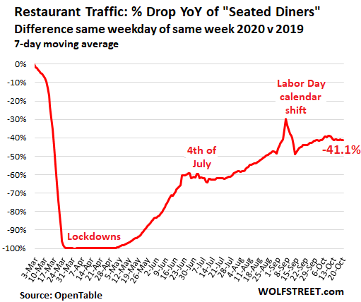
Restaurants as measured by “seated diners.”
OpenTable provides daily data on “seated diners,” tracking how many people – walk-ins and those who made reservations online or by phone – actually sat down in restaurants to eat and drink, compared to the same weekday in the same week last year, based on thousands of restaurants in the US that shared this data with OpenTable. I converted daily numbers to a 7-day moving average to smoothen out the day-to-day fluctuation.
These are the types of restaurants where diners can make reservations. They exclude cafés, fast-food places, delis, and the like. Currently, into the eighth month of the Pandemic, “seated diners” are still down 41.1% from where they’d been last year at this time:
The number of restaurants that took reservations before the Pandemic and that are now taking reservations again was still down 26.5% on average over the past 30 days, compared to the same period last year. This is a rough stand-in for how many of these restaurants have re-opened – rough because some restaurants with outside-dining only have eliminated reservations as diners might not show up when it’s suddenly too cold and windy (one of our favorites in San Francisco has done that; it’s open though it no longer takes reservations):
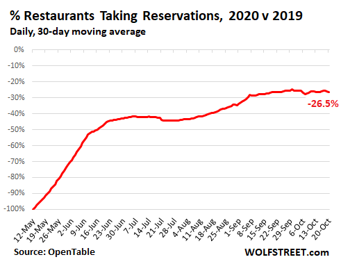
The disconnect between the number of open restaurants being down only 26.5% from a year ago, to the number of seated diners being down 41.1% can in part be explained by reduced capacity in restaurants inside or outside.
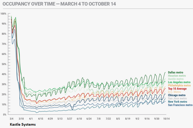
Going to the Office.
How many people are entering offices each day compared to the Good Times? Kastle Systems provides access systems for 3,600 buildings and 41,000 businesses in 47 states, and it’s using this data to establish “office occupancy.” Kastle’s “10 City Average” of office occupancy is currently at 27.4% of the pre-Pandemic level in early March, meaning it’s still down by 72.6% since early March.
Office occupancy by metro: the occupancy levels for these 10 metros is shown as a percentage of their level in early March – the “high end” being an occupancy level of just 43.3% of where it had been in early March:
- Dallas: 43.3%
- Houston: 36.8%
- Austin: 35.4%
- Los Angeles: 34.0%
- Philadelphia: 28.8%
- Washington D.C.: 24.0%
- Chicago: 21.8%
- San Jose: 18.2%
- New York: 17.4%
- San Francisco: 14.7%
Kastle’s weekly “Back to Work Barometer” shows how office occupancy in these 10 metros has developed since early March (chart via Kastle Systems, click to enlarge):

